My role:
UX/UI Design
Teammates:
Negin & Elnaz
Tools:
Figma, Miro, Zoom
Duration:
November 2024
PLatform:
Mobile
Introduction:
So, we took on this student challenge to improve the UX of popular apps and see how better design can solve real business problems. Our pick? Too Good To Go! We were curious about its low retention rate— or why so many people (including friends) stop ordering those Surprise Bags after just a few tries.
Business Objective:
Figure out how to increase the user retention or make the Magic Bag feature so good that people keep coming back.
Problem Statement:
Right now, buying and picking up those Magic Bags feels kind of confusing and inconvenient, which is probably why people bail after a while, resulting in lower retention rates.
What we’re hoping for:
By tweaking the whole experience, we want happier users, more app visits, and way better retention. Let’s make those Magic Bags magic again!
Desk Research:
We dove into the app reviews to see what people were saying. The focus? All the pain points around ordering those Surprise Bags. It was all about spotting the common struggles users were having.
No reviews? Users can’t tell if a restaurant is worth it.
Huge portions? Ends up creating more food waste.
Inconvenient pickup times make it a hassle.
No categories for items—everything feels random.
Filtering? Pretty much non-existent.
Interview:
We interviewed five current and former users of the app to really dig into their experiences. We asked about their app journey, motivations, and why they stopped—or thought about stopping. Super insightful!
Synthesising Data:
We used an affinity diagram to sort through all the interview info and spot common themes and trends, allowing us to synthesize the findings efficiently. This process revealed the key challenges users face when interacting with the app.
Top challenges we found: (Review, Variety and Quality, Quantity, Rewards and Fun, Pick up Option, Filter)
Persona Definition:
After digging into user research, we spotted three main types of TGTG users, each with their own reasons for loving (or struggling with) the app. These personas helped us get into their heads and really understand what they need.
HMW Statements:
The user research and data synthesis revealed the five most important issues:
Gamification:
Reviews and feedback:
Quantity:
Price and Offers:
Variety and Quality:
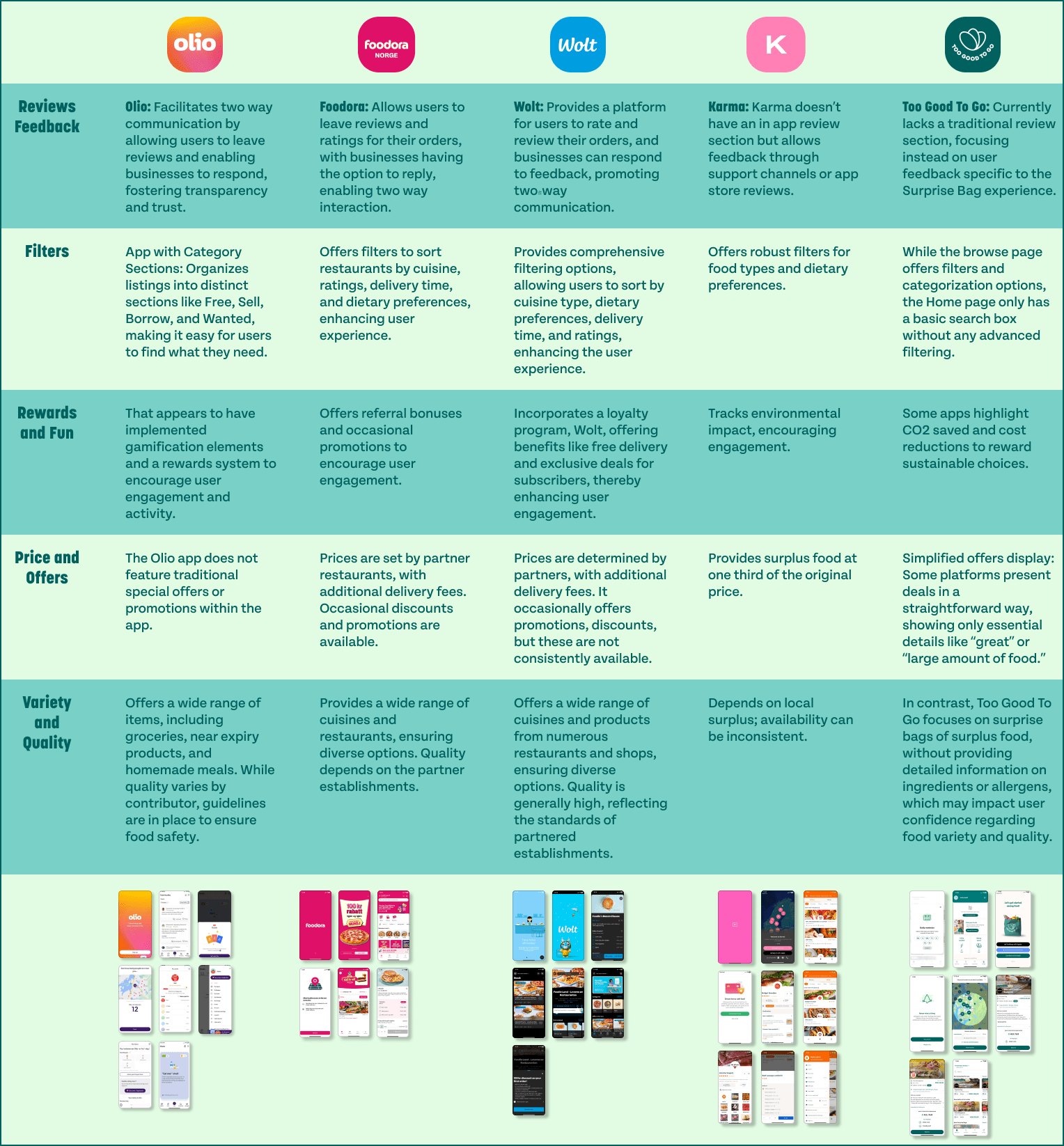
Competitive Analysis:
Before brainstorming, we checked out how other apps tackle the same problems our users face. It was super helpful to see what works (and what doesn’t), giving us a ton of inspo for our own ideas.
Impact Effort Matrix:
We conducted an ideation session, beginning with brainstorming ideas guided by our “How Might We” (HMW) statements. Then, we threw those ideas onto an Impact-Effort Matrix to see what’s worth chasing. The goal? Focus on solutions that pack a punch without being a total nightmare to build. Smart, right?
Low-Fidility Wireframes:
High-Fidility Wireframes:
Home Screen
To improve user convenience, we moved the filtering system to the main discovery page so it’s easier to find. Now you can quickly sort by food categories, days, times, dietary preferences, and even current promos. Oh, and we added a little personalized greeting to make things feel more friendly and engaging when you open the app.
Product Page:
Users are in control now! We added a Packaging Size option so they can choose the size that works best for them—no more waste, no extra costs. Smaller sizes = smaller prices, which means users save money. Plus, we threw in more photos so they know exactly what they’re getting.
Gamification and Rewards:
Collecting Time:
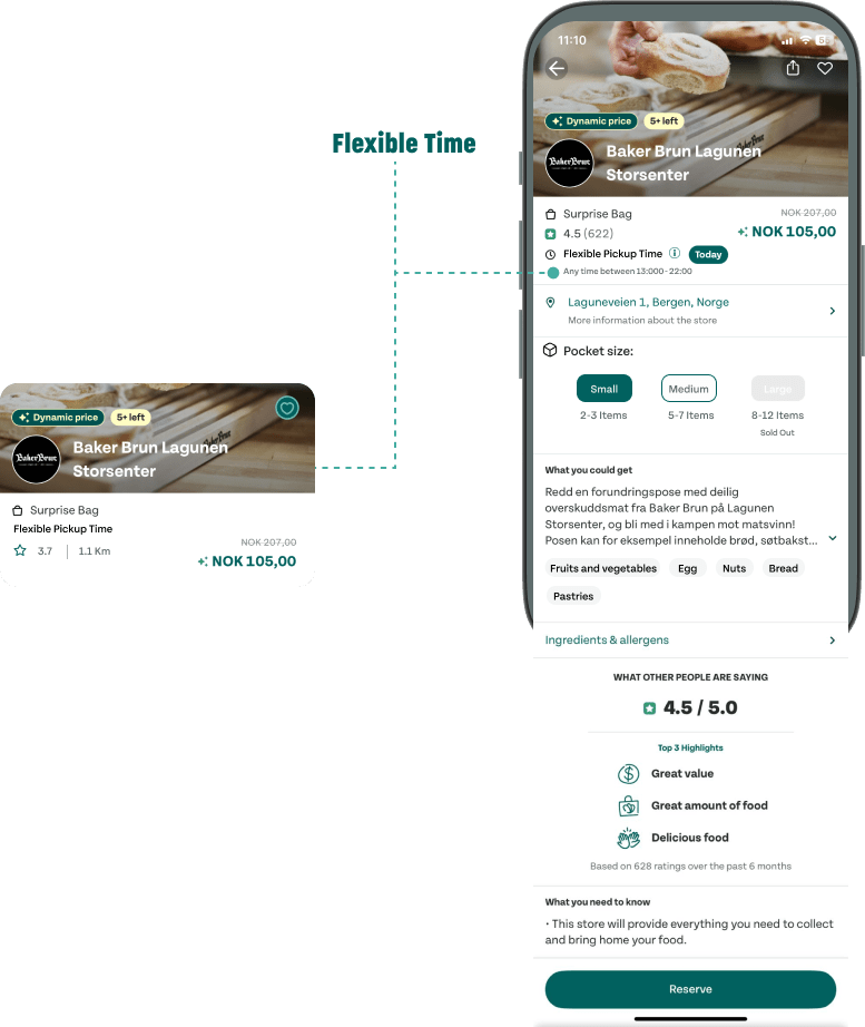
We’ve extended the pickup window and added a flexible pickup option, so users can schedule their package until the store closes. It’s all about making life easier and working around their schedule.
Category:
No more guessing! We’re clearly categorizing items in supermarket surprise packages so you can see what’s inside. This helps you make better choices, especially if you have allergies or specific needs.
Reviews and Feedback:
Trust matters, so we’re introducing a two-way feedback system. Users can share their thoughts, and the platform can respond—creating better communication and helping everyone make smarter decisions.
3 Rounds of Moderated Tests Informed Iterations that Helped Refocus on Functionality & Usability.
Participants completed scenarios while we tracked their movement patterns, mental models, and goal completion. Feedback helped us reduce cognitive load and make information clearer and easier to access.
1- Adding Size Box Price:
We added box size pricing to the descriptions so users can quickly see costs and make informed decisions.
2- Ingredients & Allergens Pop-up:
The old allergy pop-up was confusing with its fixed text. We redesigned it with collapsible drop-downs, letting users expand for details only when needed.
3- Achievement & Share Pop-ups:
To boost engagement, we introduced achievement and challenge pop-ups, along with a sharing feature to spread the word.
4- Designing Mayership Default State:
Since the term “Mayership” was unfamiliar to users, we created a clear and informative default state specifically for first-time users. This ensures they understand the feature right away, making it easier to engage with and increasing overall interest.
Final Design
Key Takeaways:
- Understanding why users are initially drawn to the app is key. Regularly reminding them of this motivation can improve retention.
Users are unlikely to return if their primary reason for using the app is no longer fulfilled. - Surprisingly, many users are not primarily motivated by environmental concerns. Instead, they value convenience, the element of surprise, and cost savings.


